Embarking on a mission to enhance the Memrise language learning platform, I focused on creating an inviting and intuitive experience that guides users seamlessly into their language journey. The goal was to turn initial user interaction into a captivating and educational pathway without the confusion or cognitive overload of the original design.
Why?
The platform's unique offering doesn’t show ! While competitors may take a more traditional approach, Memrise stands out with its lively and interactive methods. However, this spirited way of learning wasn't reflected in the homepage's initial design.
From here...
Audit
Present issues
Memrise's current homepage didn't quite deliver the fun learning experience that the platform is known for. It needed to reflect the brand's ethos of learning languages in a lively, engaging way
User research
Diving into the user's interaction with language learning platforms. I discovered that Memrise's homepage was not facilitating an engaging learning experience. It was critical to provide a welcoming entry point that smoothly guides learners into the platform's offerings.
To there!
Strategic approach
Welcoming users with excitement
The redesign focused on streamlining the entry process, making it as welcoming and intuitive as possible.
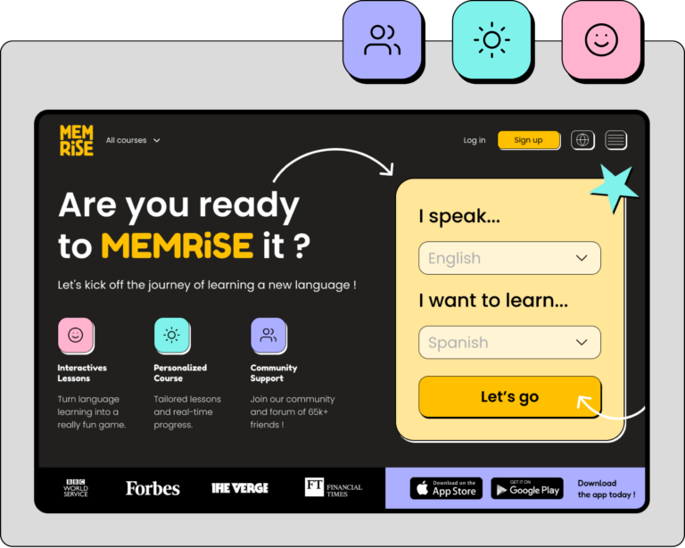
It should instantly convey the excitement of learning with Memrise. By incorporating bright colors, engaging imagery, and playful interactions right from the welcome screen, the new design invites users into a world where language learning is a thrilling adventure, not a tedious task..
Process wise (showing around 1,5% of the actual process)
Making it happen
Implementation
Implementing the FUUUUN! factor
I introduced lively graphics, interactive elements, and a user-friendly layout that makes each learner's journey feel more personal and enjoyable.
Interactive sign-up
By reimagining the sign-up process to be more interactive, I aimed to capture users' interest and guide them with prompts that feel less like a form and more like the beginning of their language adventure.
Unified system and page ratio
A new design system was implemented to enhance visual and interactive harmony across the platform.
On top of that, I dedicated 50% of the page real estate to action-oriented components, including the sign-up process and app download options, guiding users towards engagement and action.
Dark + light modes
Light and dark mode versions allow to cater to user preferences for readability and comfort at any time of day, ensuring that the learning experience was not only cohesive but also adaptable to different environments and user needs.
Memrising it !
Results + outcomes
What about now ?
The redesigned Memrise homepage is now a true reflection of the platform's philosophy: language learning can and should be a delight. The new design effectively communicates this vision, resulting in a significant increase in user engagement and positive feedback from the community.
Get in touch!
I'll be more than happy to give you ccess to the figma files or just have a chat.