Pivotal platform for apartments search in Germany, WG Gesucht’s mobile app needed to create a more engaging and seamless journey, thus redefining the way users connect with shared or privately owned living spaces.
What was wrong with it ?
Overall, we’re getting lost in the mess. Frustration builds up because of a lack of intuitive guidance,passive engagement due to no compelling CTA or incentives and design inconsistencies make for an overwhelming experience.
Design assessment
Audit
User Research
Looking at the most important things users want during an apartment search, we realized we often miss a central hub for user navigation when starting their housing journey.
The goal was to create a more engaging and seamless journey without taking the risks of getting lost in the abundance of offers by always having a place to go back to.
Present issues
Frustration builds up because of a lack of intuitive guidance.
Passive engagement due to no compelling CTA or incentives.
Design inconsistencies make for an overwhelming experience.
All these problems added up, making the app harder to use and leading to a much-needed strategic redesign.
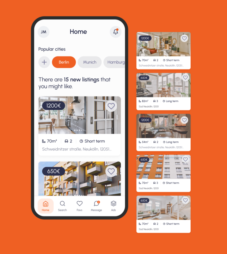
A clear path Home
Strategic approach
Crafting the Solution
I introduced a home page to serve as the central hub for user navigation when starting their housing journey.
This new home page is the anchor of the user's journey, designed to welcome users and points you exactly where you need to go.
We established this hub would need to do 3 essential things : See their notifications, navigate to their saved searches or dive straight into the freshest offerings on the market.
Making it happen
Implementation
Visual consistency
Creating a uniform system for box sizes and margins, fostering a visually consistent environment across the app as well as an harmonious combination of space, type, and function should clarify the app's offerings and invites users to engage more deeply, setting the stage for a seamless navigation experience.
Incentivized user actions
The redesign now actively invites participation with personalised recommendations and notifications that spark engagement.
Recommendation card listings
To enhance personalization the UX, we created a list of recommendations that dynamically curates property suggestions based on the user's search behavior.
Navigation Overhaul + Icon system
The app's navigation has been refined for clarity, featuring a minimalist layout with prominent icons. The active page is highlighted with a distinctive colour to make it easily accessible.
Design System
Consistency, structure and communication
We came up with a design system to add consistency, structure and communication. We chose urbanist typeface that would improve reading legibility at both small and large sizes. The colour palette is mature yet modern and has good contrast. Following that design system, we also implemented icons and to bring some fun and consistency to the app.
Ready to go anywhere
Results + outcomes
Learnings
This project underscored the significance of user-centered design. Challenges such as aligning with modern design trends while maintaining the app's familiar usability were met with iterative design and testing. The redesign affirmed the value of clarity, simplicity, and personalization in creating an effective user interface.
Wanna see more ?
Ask to dive into the design details of this project !